
Case Study
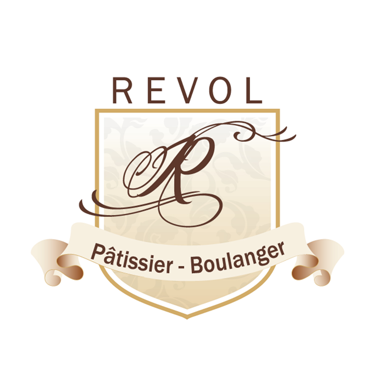
A Sweet Brand Identity for Alexandre RÉVOL
Alexandre Revol and his wife own a bakery in the heart of Bourg les Valence. My husband’s family have a history of purchasing their crafted desserts, fresh baked breads and especially their cakes for more than a decade. When I moved to France, their bakery was already deciding on opening their second bakery in town. As a weekly buyer who wanted to taste all the seasonal desserts they freshly made, I noticed their business did not have a branding identity for their little shop, business cards and marketing materials, and especially a logo. I quickly took the opportunity to give them some advice when my communication in french was good to par. Eventually they were full on board when they knew I was a designer, photographer and a frequent customer. It was time to refresh their visual identity and create a branding that reflected the quality of their desserts.
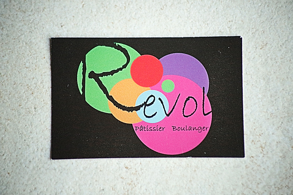
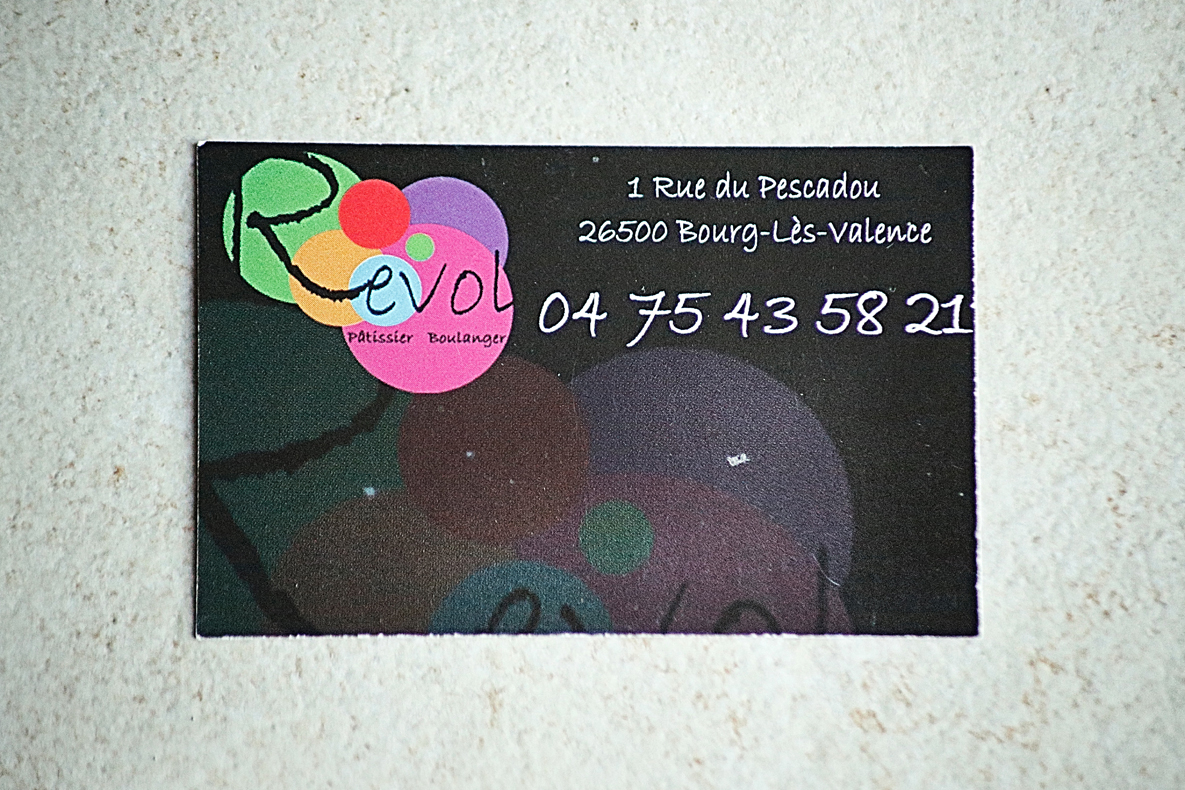
Before
Here’s a preview of the previous business cards designed for RÉVOL – Pâtisserie et Boulangerie. Unfortunately, the cards lacked a clear concept, visual hierarchy, and brand direction. Also, the busy graphic elements did not reflect the personality of the business, which did not say ‘Bakery’.
Growing a Bakery
Some projects are about creating a beautiful logo. Others are about helping a business tell its story before a customer even takes their first bite.
Building a Brand with Personality
Every successful brand begins with understanding the people behind it.
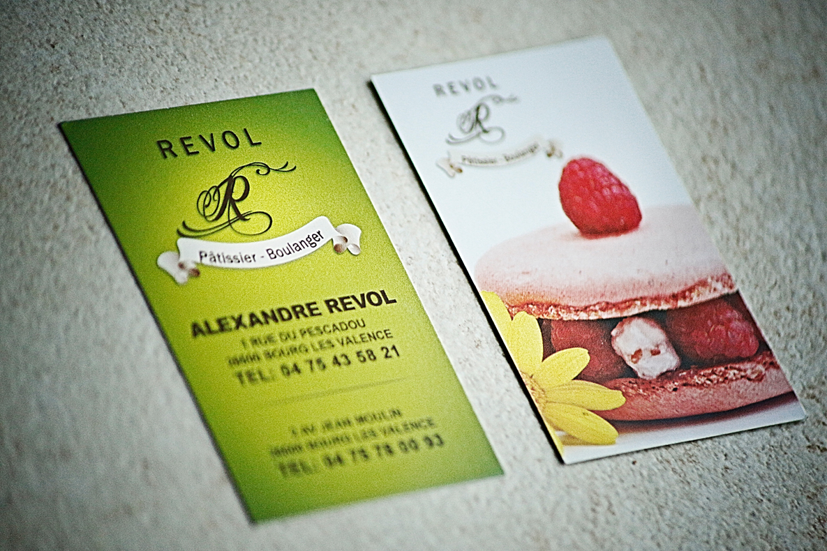
Alexandre and his wife wanted their bakery to feel welcoming, modern, and memorable while still conveying the craftsmanship that goes into every pastry they make. Together, we developed a color palette that perfectly represented their vision. The soft pistachio green brought freshness, elegance, and a natural warmth, while the Barbie raspberry pink added a playful personality that immediately catches the eye. The combination created a unique identity that feels both luxurious and inviting—just like stepping into a boutique pâtisserie.
Every design decision was intentional, ensuring their brand would stand out while remaining timeless.
Designing Business Cards That Sell
With a new location opening, they needed business cards that did more than provide contact information. Rather than relying solely on typography and logos, I designed their business cards that showcased their beautiful desserts. High-quality photography became a central element of the design, allowing customers to immediately connect with the products they create and remember them.
A business card should be more than a piece of paper—it should become a small marketing tool that people don’t want to throw away.
Elevating Their Desserts Through Photography
One of my favorite parts of this project was photographing their desserts. As an Asian American, I love food in general, but I especially love desserts because when I was a kid, the only time we had sweets was at Filipino parties. Moving to France has opened my palette for desserts and the artistry that comes with it.
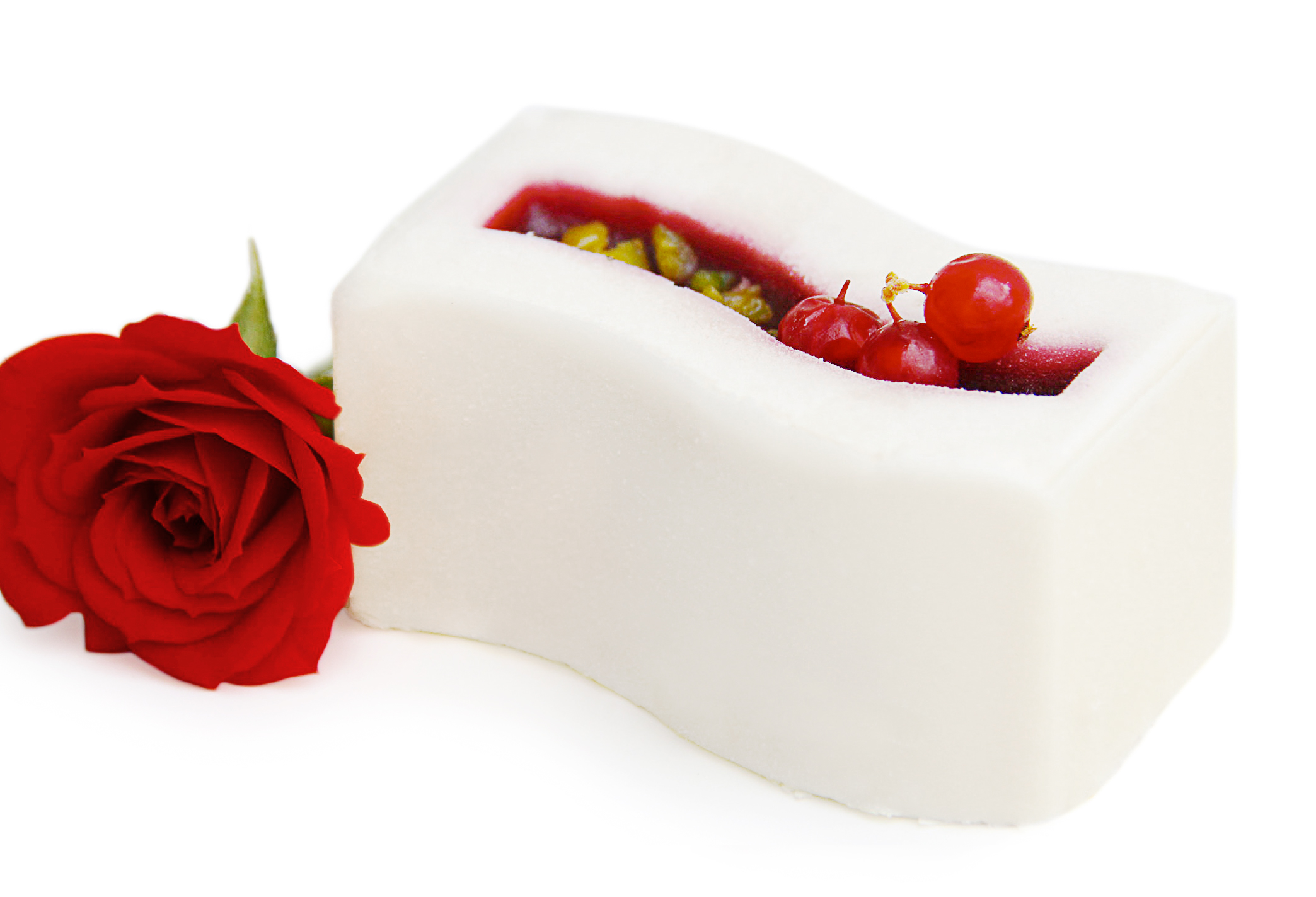
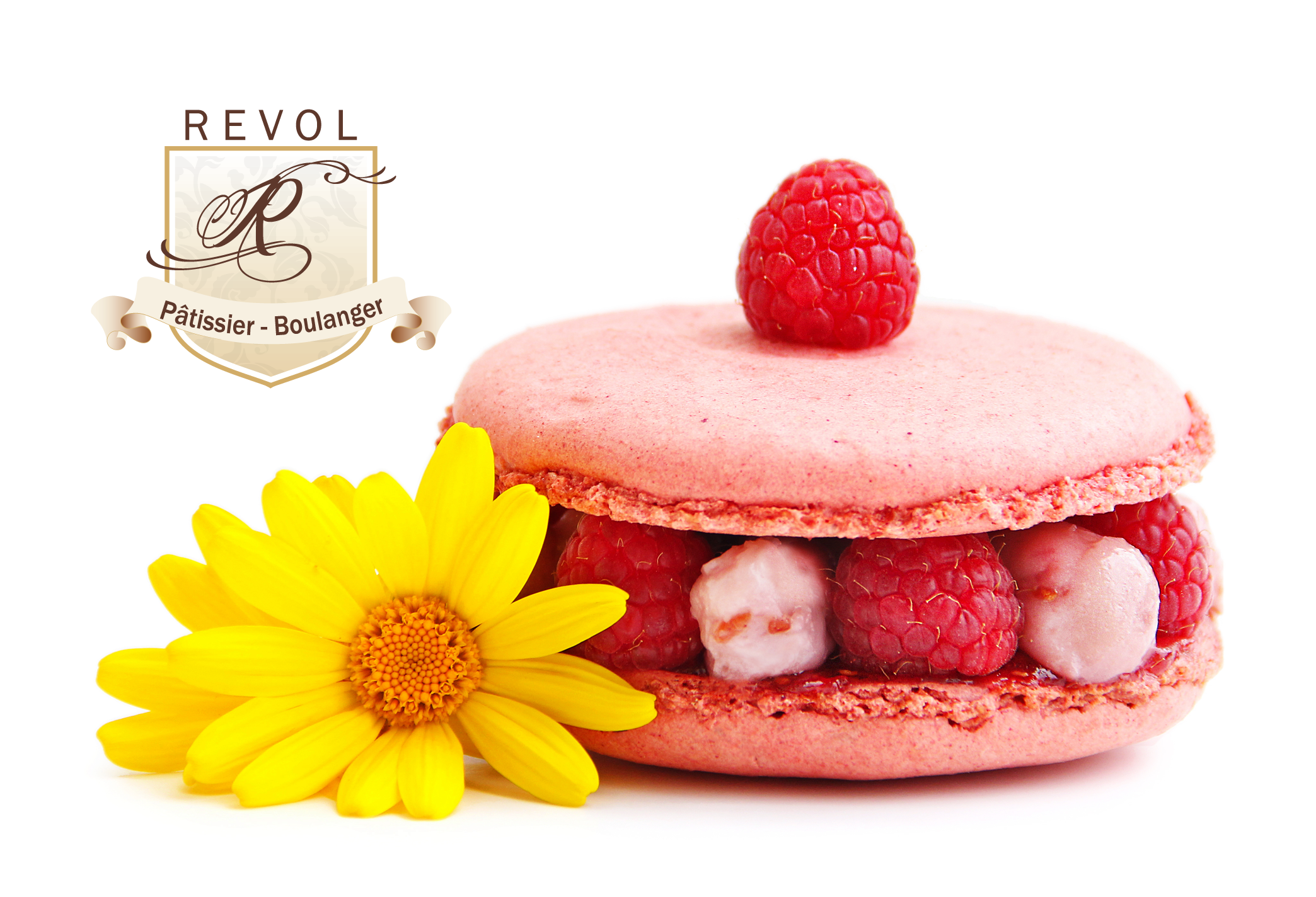
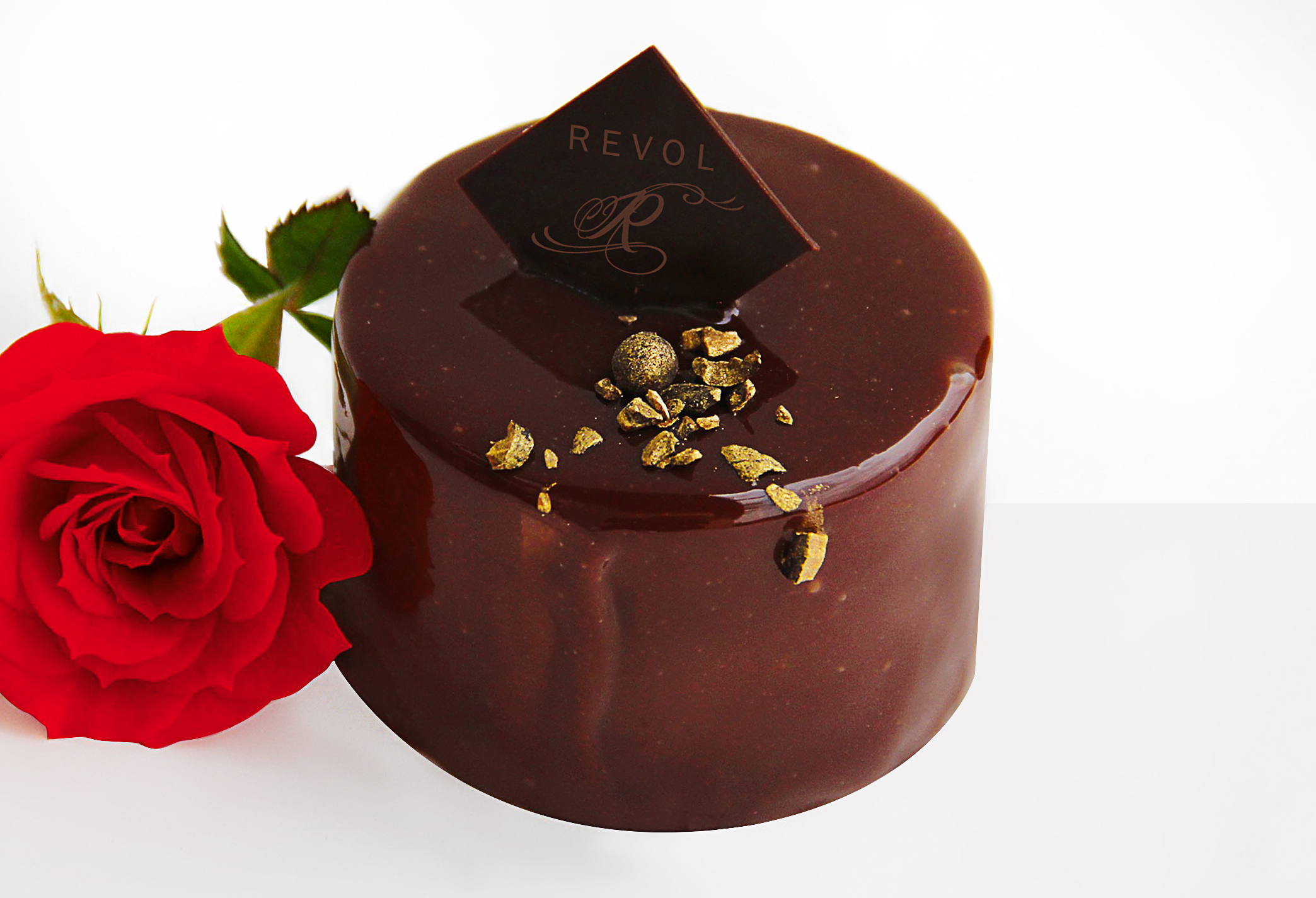
Presentation matters. Instead of simple product photos, I approached the session with a luxury editorial mindset. Careful lighting, thoughtful composition, and clean styling transformed each pastry into something that looked as irresistible as it tasted.
Luxury isn’t always about expensive products—it’s about creating an experience. Professional photography allows customers to perceive quality before they even take their first bite. The final images became valuable marketing assets that could be used not only on the business cards, but also across social media, printed materials, and future promotional campaigns.
The Final Identity
The completed branding package reflected exactly who they are as a business:
A distinctive logo that represents their growing bakery.
A fresh color palette built around pistachio green and Barbie pink.
Business cards designed to showcase their desserts and strengthen brand recognition.
Premium dessert photography that elevated the perception of their products.
Seeing their new branding come together as they expanded into another location was incredibly rewarding. It’s always exciting to watch a small business invest in its future and create a consistent identity that customers can instantly recognize. Projects like this remind me that good design isn’t just about making something look beautiful. It’s about helping people communicate their passion, attract new customers, and build a brand that grows alongside their business.
For me, every branding project is an opportunity to tell someone’s story through thoughtful design—and this sweet collaboration was one I’ll always remember.
View more case studies from Penelope
Nicolas Carré – Chiropracteur
