Case Study
Designing a logo and identity for Dowell Farm and Gardens
Dowell Farm and Gardens is a family-operated farm based in Grand Rapids, Minnesota USA that started in 2022. Their motto ‘Fresh, locally grown vegetables, flowers and plants’ is well noted in their community by their commitment to growing organic produce and providing it to schools, hospitals, local markets and businesses. Within just a few years, they were honored with the Family Farm of the Year Award 2024 in Itasca County. Soon after, their followings increased by the numbers.


Overview: Approach & Contributions
Penelope at Peralta Studio was approached to design a simple, identifiable mark for the farm that would stand out from the competition, but also provide scope for the brand to become a distinguishable farm and reputable partner for the community.
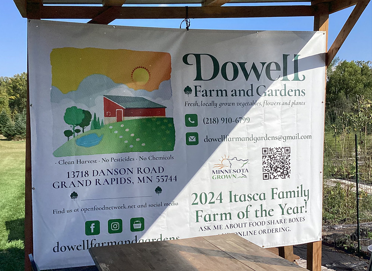
Referencing the environment of Minnesota, I felt it was essential that the logo identity feature the colours of summer since many farmers know farming consists of only six months of the year and the other half is winter. I introduced a watercolor effect to add a playful aesthetic to the design, and referencing on images the clients had given me.
Distinct visual elements featuring the surrounding landscape, a lake, a red barn, flowers and their produce were implemented to ensure memorability. A warm colour scheme, gave the identity a friendly and homely approach.
Hence, for the logo, I used a pine green colour, which symbolize rebirth, renewal, and immortality.


A logo design and identity for Dowell Farm and Gardens was designed and inspired by the surroundings of the Dowell's farm. This allowed me to design a creative, fun and memorable identity for the business that would stand out from the more traditional farms and local vendors within the Grand Rapids area.
Their mottos ‘Fresh, locally grown vegetables, flowers and plants’ and ‘From Our Farm to Table’ are words the Dowell Family live by. They provide local farm-to-school programs in their farm and collaborate with other local farmers to educate about food and why it is imporant to supporting the farmers in their community.
To bring the farm identity and type design together, the font was customised while incorporating their moto into the design. All the elements came together in the final logo as a stylish and modern design that perfectly solves the challenges faced.
Dowell Farm and Gardens produce their own sauces and jams as well as selling flowers grown from their farm. Penelope worked on the label designs for their produce and continued using the same font family. For presentation purpose, it was important for their business to have their information, an expiration date, the list of ingrediants and the description of the product (so the customer knows what to expect).
Client communication through the stickers was imperative. The Dowell Farm always changed the date of expiration, therefore my solution to handwrite them whenever they made new batches of sauces and jams solved their tight budget and their problem of updating their labels.
To keep a minimal and refined appearance, the bottle designs includes only the elements that’s needed. The logo, product name, and volume on the front, then the rear of the bottle is their contact information, showing the bare minimum information to ensure the product is compliant. A QR code was also implemented for easy access to their website online.
The final product all together forms a clean, minimal and fun design that aligns the product with well-known produce brands.


